

SHARE


With mobile traffic to websites growing rapidly, it’s important for retailers and others to focus on reducing friction to convert more visitors to avoid shopping cart abandonment.
One key area that often produces friction and can frustrate users to the point where they abandon is form completion. During peak times for online shopping it’s essential to convert your users either for a sale or through micro conversions to use later down the line.
In this article, we’ll look specifically at mobile web form design strategies, to make it easier for sites to convert mobile shoppers. We also provide some mobile form design examples, from websites doing it right and who have a high mobile conversion rate.
Mobile form design strategies can be more of a challenge than desktop for a number of reasons:
- Smaller smartphone screens allow less space for designing forms and adding key features like explanatory text.
- Touch inputs can be less precise and more likely to produce errors from users.
- Mobiles are often used in transit, or in situations where the user is hurried or cannot give forms their full attention.
- Variable mobile internet connections can make form filling more difficult.
Why Mobile Form Design Strategies Matter
Stats from 2020 highlight the importance of a focus on improving mobile conversions.
Adobe stats show that retailers received the majority of their traffic from smartphone users, but didn’t convert them so well, with just 35% ending up buying on mobile.
However online sales on mobile are 3% higher than in 2019 suggesting there is a slow uptrend in mobile conversions.
According to research and insights by SaleCycle in 2020, online traffic continues to grow via mobile with 68% of shoppers browsing on mobile and 56% of online sales completed on mobile.
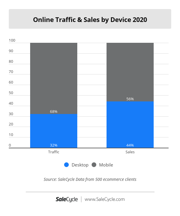
(Below is 2019 online traffic and sales by device comparison)
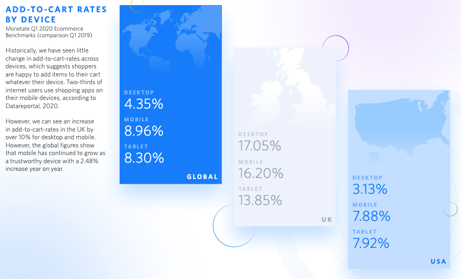
Stats from Monetate 2020 show a big difference in conversion rates. Desktop traffic to retailers converts at 1.98%% while the same figure for mobile is just 1.81%.
These figures also come off the back of add-to-cart rates on mobile, which are 8.96% and on desktop are 4.35%. The data suggests customers are happy to add items to their cart on mobile but conversion rates are slightly behind where we would expect them. This is where a browse abandonment or cart abandonment solution could help to retain users and recover lost sales.
There are several reasons why users may abandon forms. Some are to do with the actual design of the form, while others are about the motivation of the user to complete the form.
If you ask a shopper to complete a survey sent via post purchase email for example, which is quick and easy to complete, many will take the time. If it takes five minutes and plenty of effort, then forget it.
People need to be motivated to complete a form. This may be the desire to buy a product, book a flight, or the need to ensure you have car insurance.
This motivation is a starting point, and well-designed mobile forms help to ensure that the effort required to complete them doesn’t take away that momentum.
With this in mind, here are some best practices for mobile forms to make them less painful to complete.
15 Mobile Form Design Examples To Increase Conversions
Use a Single Column Design
This is generally best practice for mobile and desktop forms, but is even more important on a smaller screen.
Single column layouts are easier to read as users can focus on one column at a time. This approach also makes forms seem cleaner as less daunting for the customer.
Chunky Form Fields
Form fields are a harder target than desktop, so there is an increased likelihood of user error when attempting to click inside a field.
The answer is therefore to make form fields big enough, and with enough space between them, so that users can click into them without risk of error.
Make Forms Visually Appealing
If a form looks dull, then it can deter users before they even begin to complete it.
A simple and easy to read form with some useful visual elements looks more professional and easy to complete.
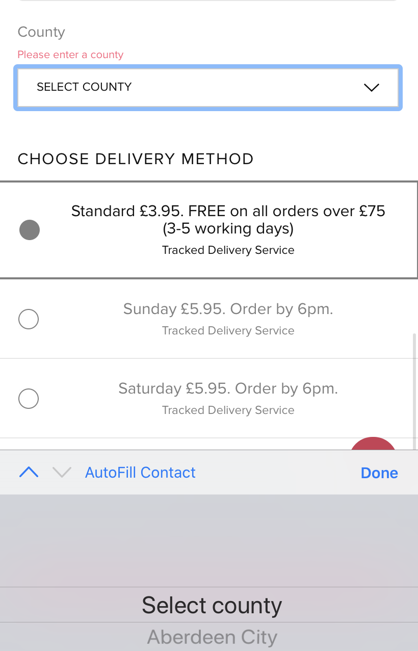
Break up Longer Forms
Long forms can deter users, as they can seem like lots of hard work, but good design can address this issue.
Breaking up forms into more manageable chunks can make the task of form completion easier for users.
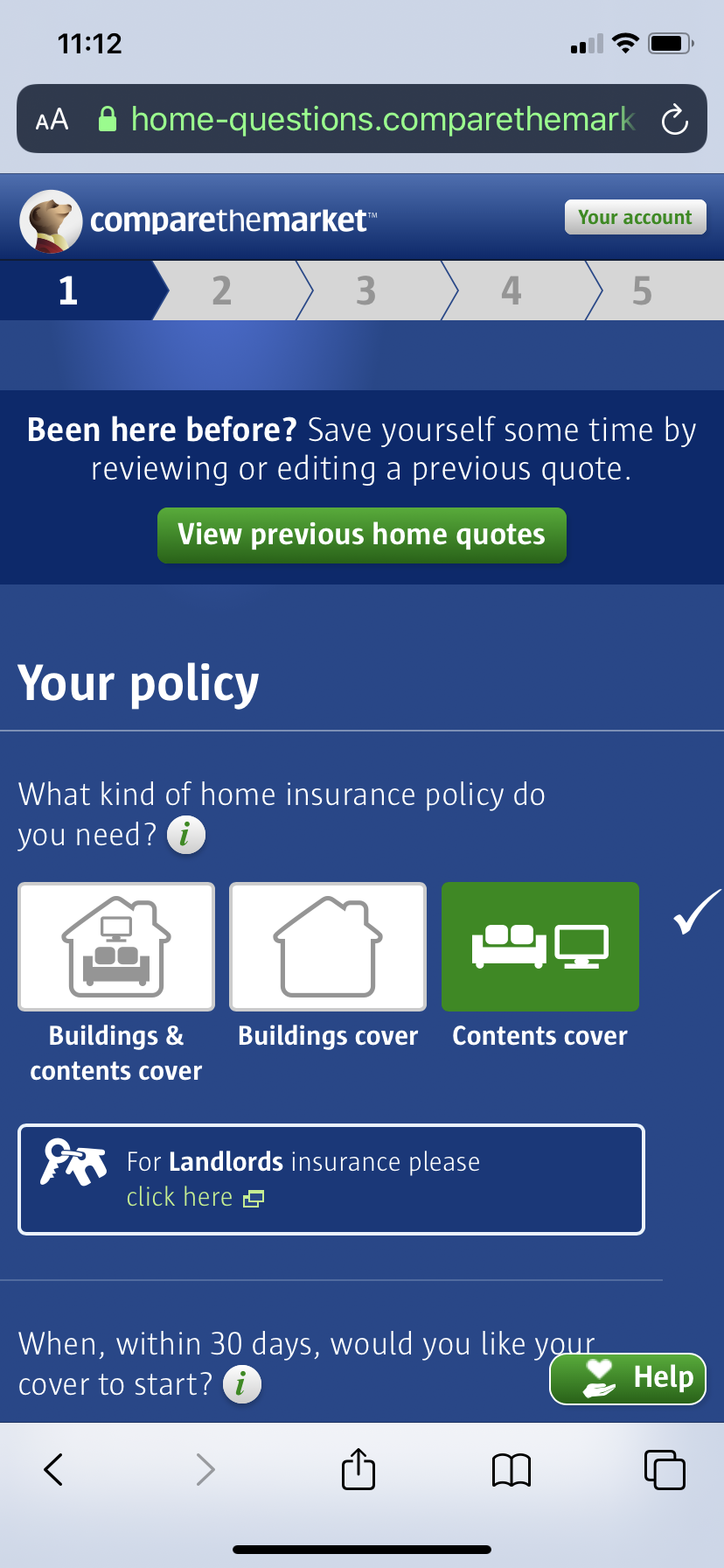
Here, comparethemarket breaks up its home insurance form into five sections.
Show Progress Indicators
Progress bars are great to use to let shoppers know just how far through the checkout process or form they are.
This can encourage them to keep going, knowing they’re making progress through the form.
Minimise the Number of Form Fields
If you can reduce the number of form fields by removing unnecessary questions, then this reduces work for the user.
Broadly speaking, if a field isn’t essential for completing the quote or purchase, then you should consider removing it.
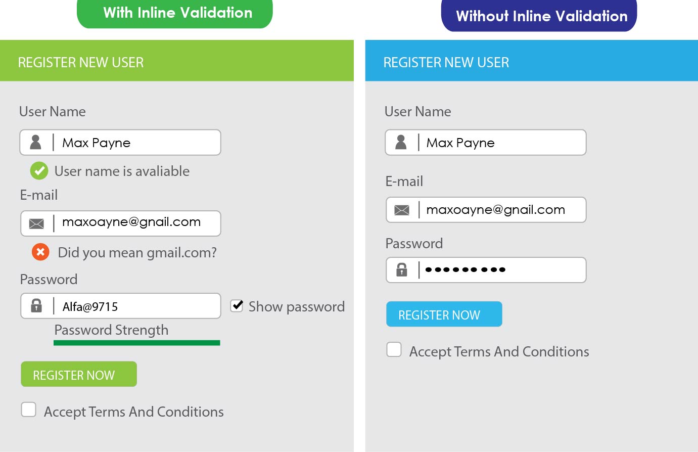
Provide Clear Feedback and Validation
Providing clear feedback at the point where users enter data helps to speed them through the form, confirming that they have entered data correctly and offering suggestions.
In the inline validation example below, providing feedback at the point where data is entered is better than having users click ‘register now’ and then finding they’ve made errors.
Clear and Concise Error Messaging
People will make errors as they complete forms, but this needn’t be an issue if error messages are useful.
Error messages should:
- Be easy to notice, and easy for users to understand.
- Highlight the form field where the error has occurred.
- Provide clear instructions on how to fix an error.
Anticipate Common User Errors
It can also help to anticipate common errors and account for them. Analytics data and user testing can help you to identify fields that are tripping users up.
One error which used to be quite common on ecommerce sites (and still causes problems on some) was around postcode entry. People typing postcodes with or without a space in the middle, or perhaps using lowercase text could trigger an error message.
The best approach is to anticipate this and allow users to enter postcodes in any format. It saves creating a point where users may abandon forms.
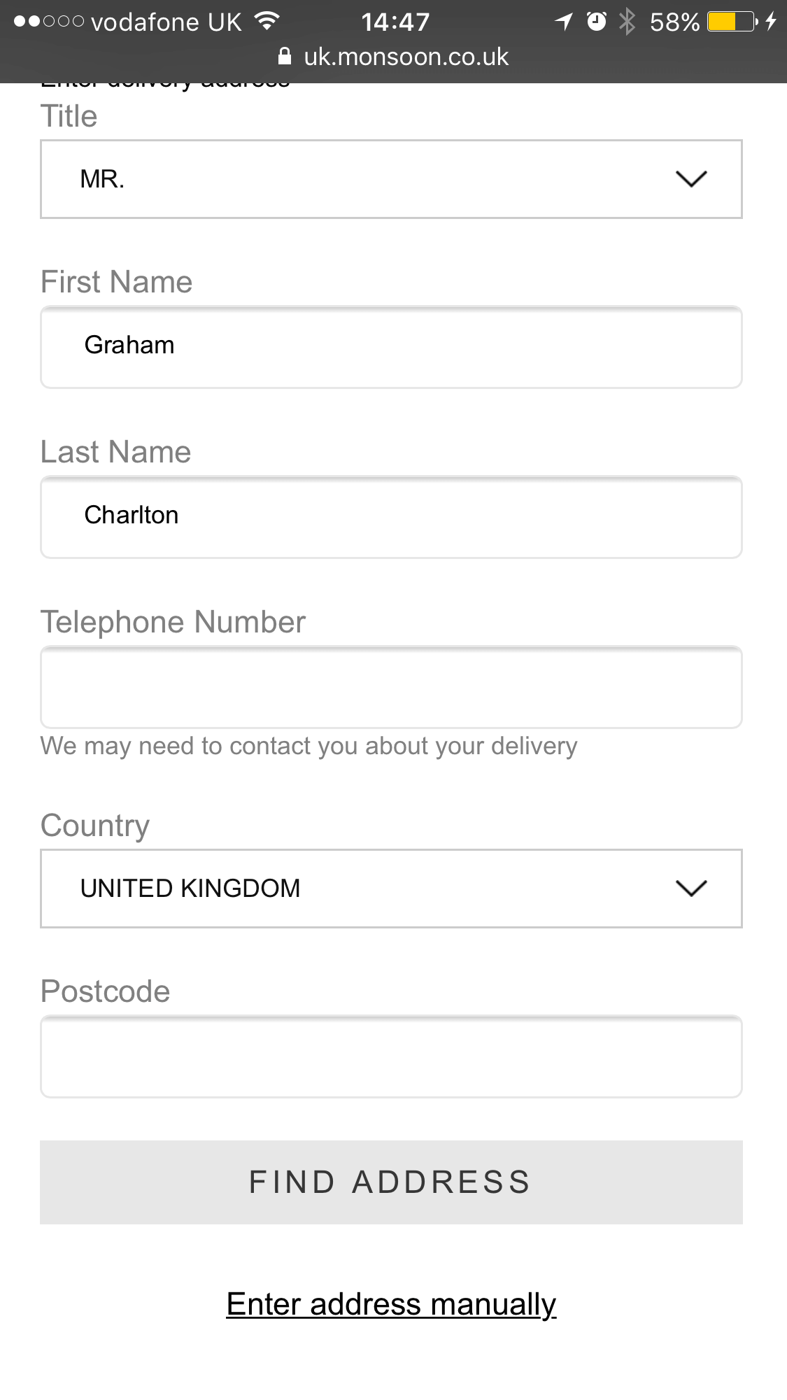
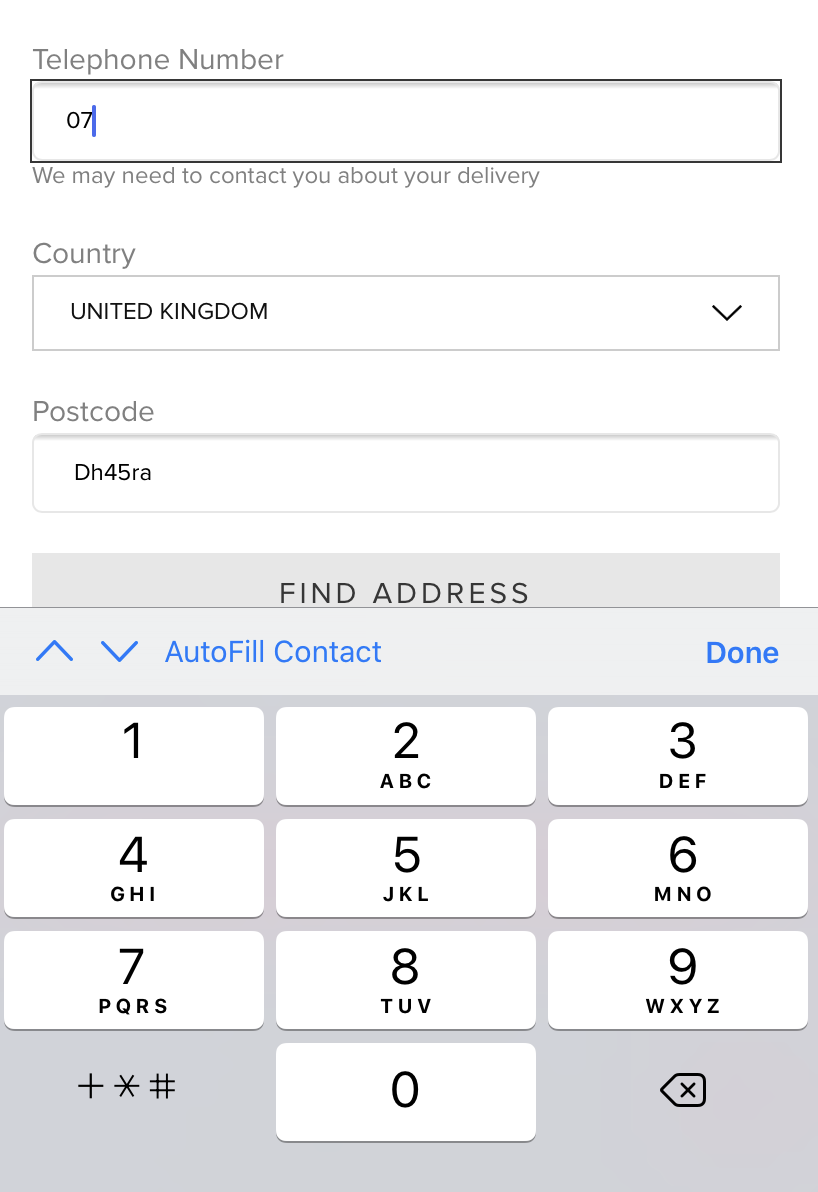
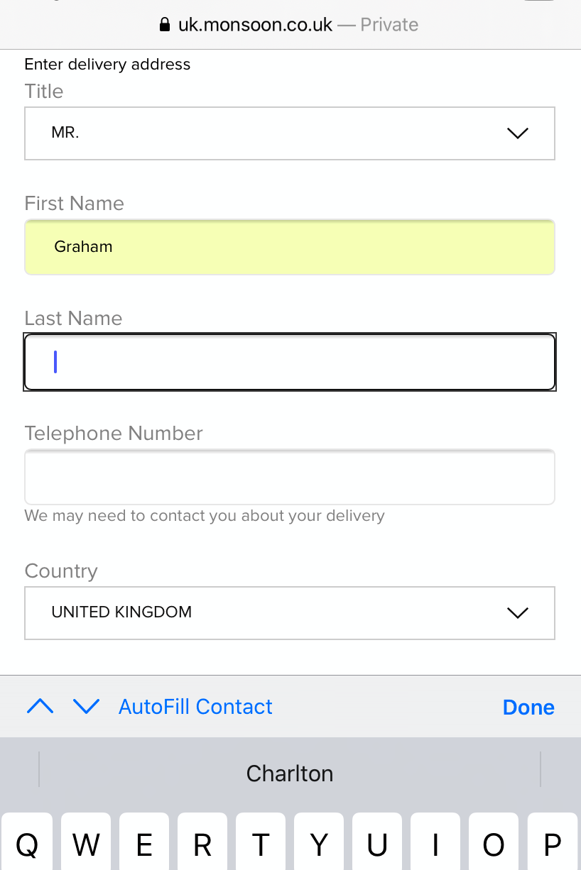
Show Suitable Input Keyboards
This is an area where smartphone features can help to make forms easier for mobile visitors.
Simply showing the best version of the touch screen keyboard for the form field – numeric for telephone number in this case – makes is easier for users, thereby reducing the risk of errors and speeding up form filling.
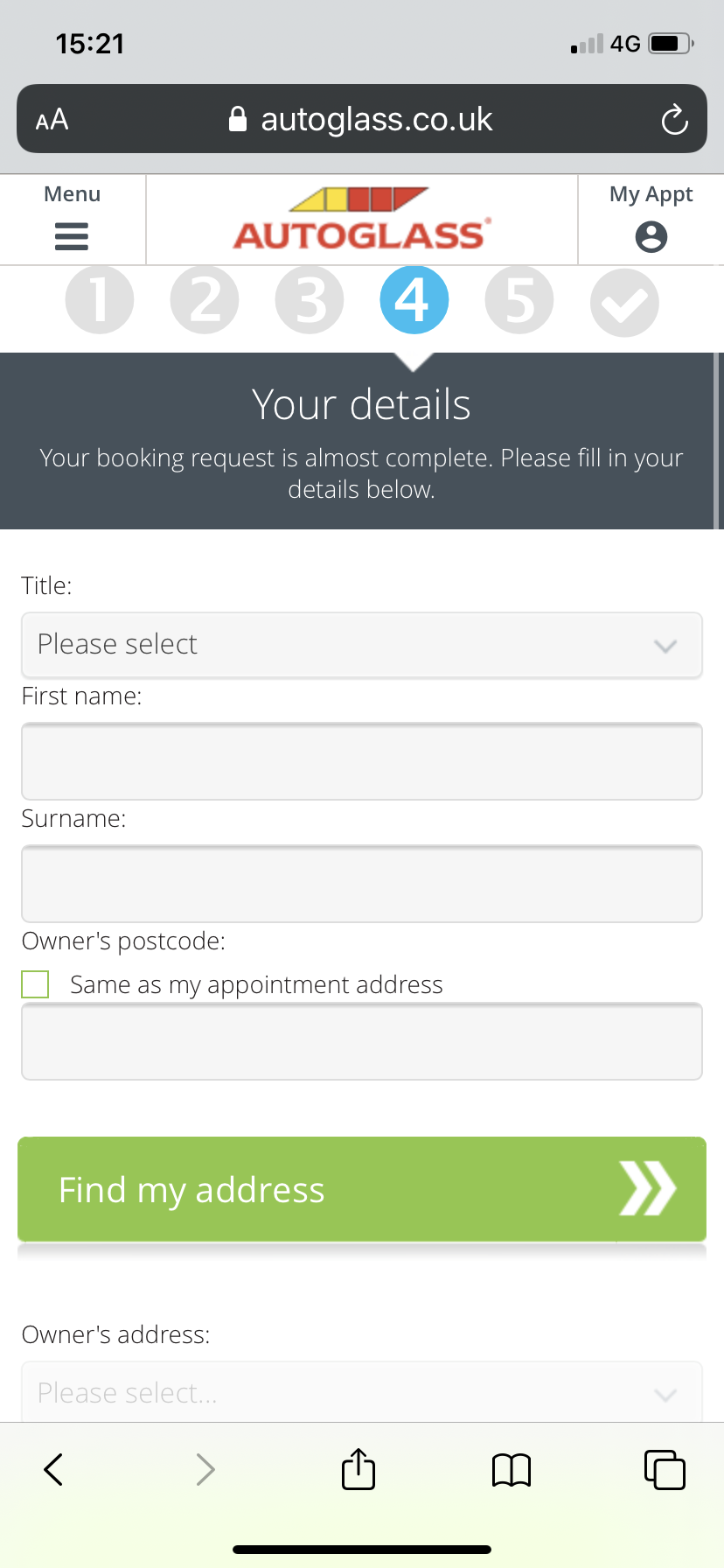
Place Form Field Labels on Top
This is easy to read and creates more room for form fields on a mobile screen.
Use Clear and Well Defined CTAs
Calls to action (CTAs) should be easy to spot, and the wording should make it clear what the next step is – complete purchase, submit quote etc.
It should also stand out on mobile and be large enough to be unmissable, as well as ensuring they’re far enough away from other links to avoid errors.
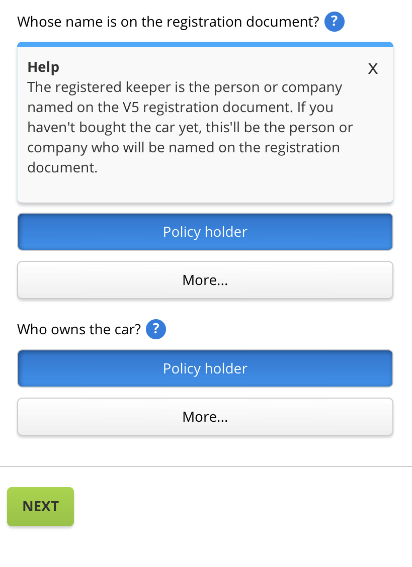
Use Microcopy Where Appropriate
Text around form fields can be used to explain certain fields and information required to help users to complete forms.
Used well, microcopy, can help to reduce basket abandonment by providing key information at the right time.
It can be used to explain why key information is needed, and even where to find it, as in this car insurance quote form.
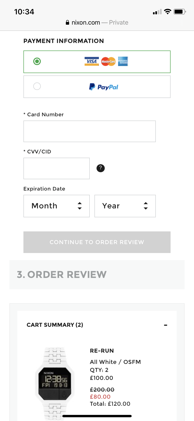
Add Autofill Where Possible
This is another way to save the user time and make mobile web forms easier to complete.
It reduces the amount of typing users need to do, again helping to reduce abandonment.
Provide Mobile Friendly Shortcuts
Any shortcuts during form completion and checkout can help to make mobile forms easier and increase conversion.
Payment shortcuts are an easy win for retailers, as they remove the need to enter payment card details and shorten the payment process.
Here, this cinema checkout allows uses to scan their credit card to populate the fields.
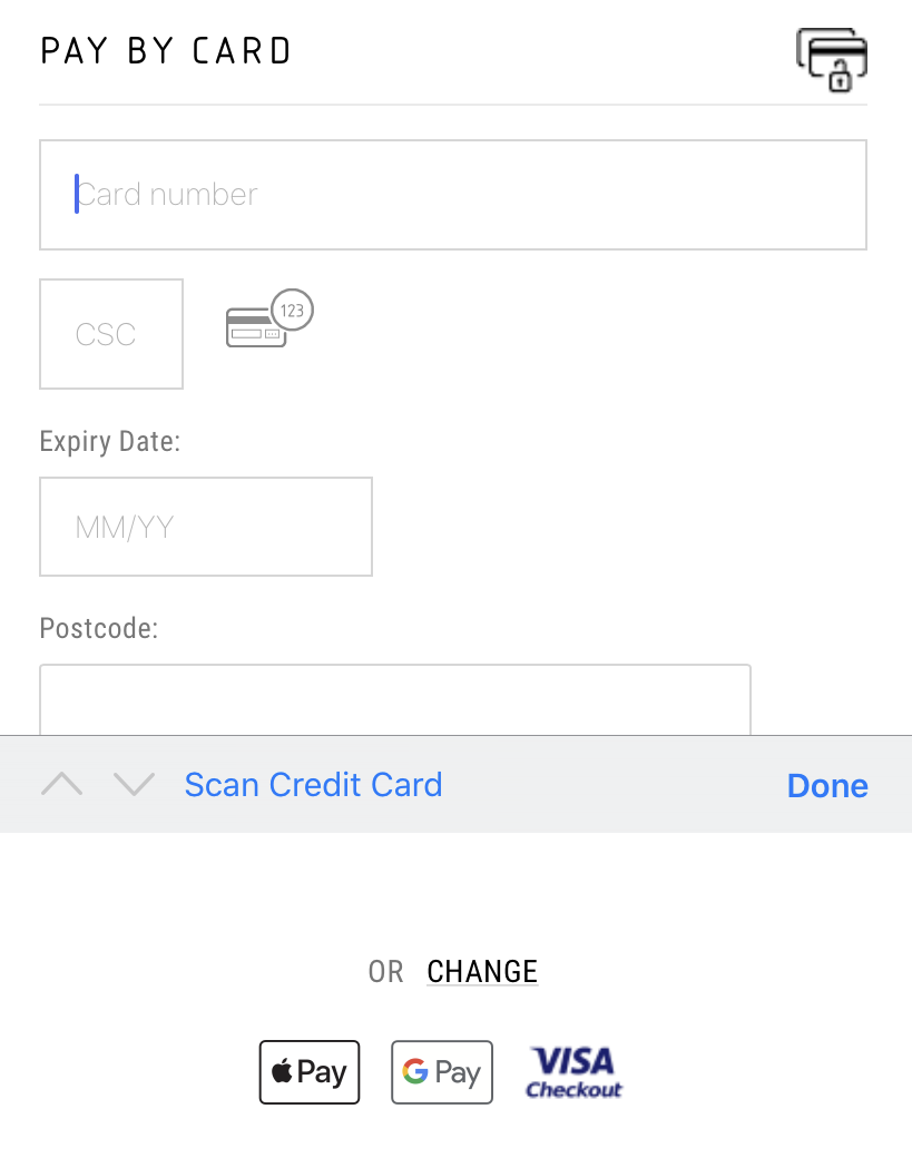
The option of Apple or Google Pay is also offered, so mobile users can pay quickly with face or touch ID.

Reviewed by Brad Ward
Written by Graham Charlton
— Updated on 1/07/2021
NEW EBOOK
⬛️ 2023 Black Friday Ecommerce Strategy & Stats Report
This FREE ebook gives you the methods, solutions & trends for building a high-converting remarketing strategy for Black Friday

Speak to an expert
Learn how to convert your online audience into revenue with our experts.

Graham Charlton
Graham Charlton is Editor in Chief at SaleCycle. He's been covering ecommerce and digital marketing for more than a decade, having previously written reports and articles for Econsultancy. ClickZ, Search Engine Watch and more.


![Valentine’s Day Ecommerce Tips and Trends [2024 Strategy]](https://www.salecycle.com/wp-content/uploads/2019/01/valentines-ecommerce-1.png)


![How SaleCycle helped Vodafone increase their online sales by an additional 2,000 additional sales per month [Extended Version]](https://www.salecycle.com/wp-content/uploads/2023/08/vodafone-banner.webp)


