
SHARE


In this post we look at the issue of choice paralysis and how online retailers can minimise the problem.
Variety is great, and providing more choice for customers seems like the right thing to do – however, too much choice can be a problem. SaleCycle has taken a look at the issue of choice paralysis and, more importantly, how online retailers can minimise the problem to help customers choose right products both for them and for your business.
What is Choice Paralysis?
The term ‘choice paralysis’, also known as analysis paralysis, sounds quite clinical – however, this phenomenon affects the ecommerce customer journey when purchasing an item, therefore affecting your business.
The theory of choice paralysis is that, the more options people have to choose from, the harder the decision becomes – we can’t make up our minds. This is a well-known theory, and something which is especially relevant for retailers with a wide range of products.

What Causes Choice Paralysis?
Although we want to provide as many sales opportunities as etailers and therefore display as many items or services as we can, this can actually have the reverse effect and make the potential customer leave the site.
Too much choice means purchase decisions are more difficult and some customers will not buy at all. For e-commerce, this can mean increased shopping cart abandonment. In this case, due to all of the choices on offer, people spend time worrying if the other options they rejected may have been better – this means that choice paralysis may also lead to higher returns rates.
Choice paralysis is part of the customer behaviour prediction phenomenon, and overall affects the customer’s urge to buy at perhaps a crucial stage in their customer journey.
While other studies have replicated and supported the theory of choice paralysis, it’s important to note that this doesn’t necessarily apply to every situation. Sites need to look at their own data to identify areas where choice may be an issue, and look to limit the problem – you can test this theory out by making use of AB testing ideas on your site to find out for yourself.
There is likely to be a happy medium somewhere where there is enough choice to satisfy most visitors but not so much that it deters them.
For example, changing mobile form design – perhaps reducing form fields – seems like a sensible solution to minimise form abandonment, it isn’t always the right thing, as these examples from Conversion XL show.
6 Ways To Reduce Choice Paralysis
While other studies have replicated and supported the theory of choice paralysis, it’s important to note that this doesn’t necessarily apply to every situation. In some cases, choice can be a good thing when customers feel they have had a chance to weigh up the options and come to an informed decision.
The key to minimising the problem of choice is simplicity online – and this all comes down to making your site as simple as possible to be able to retain those customers. Reducing choice paralysis ties in with other e-commerce best practices such as keeping the customer journey as simple as possible, and reducing clutter.
Sites need to look at their own data to identify areas where choice may be an issue, and look to limit the problem – you can test this theory out by making use of AB testing ideas on your site to find out for yourself.
There is likely to be a happy medium somewhere where there is enough choice to satisfy most visitors but not so much that it deters them. Here are some great examples of ecommerce sites that avoid customer choice paralysis:
1. Optimised CTA
Reducing choice paralysis ties in with other e-commerce best practices such as keeping the customer journey as simple as possible, and reducing clutter.
For example, a well-placed and optimised ecommerce CTA (call to action) works better when other elements on the page aren’t competing for the user’s attention. So the CTA on this Airbnb page is easy to see thanks to colour and contrast.

2. Help Users to Differentiate Between Choices
Over the years sites like the big insurance aggregators have worked hard on simplifying the selection process by using smart product configuration and filtering, helping customers pinpoint what’s right for them with the minimum of clicks and decisions.
If you check the process on a site like Moneysupermarket.com, the UI design has been cleaned up, the process shortened and UX techniques like tool tips used to help consumers decide.
Choice can be a good thing when customers feel they have had a chance to weigh up the options and come to an informed decision.
This is easier for some products than others. Let’s take laptops for example – there’s a lot to compare between various models and shoppers may need some assistance.
Comparison tools like this from Best Buy can help a lot, as they allow shoppers to easily compare features and specifications side by side.
It saves the work of visiting individual ecommerce product pages and helps them to come to a more informed decision, having weighed up the pros and cons of various models.

Another way to help customers to decide is to pick out and recommend particular models, as in the ‘our experts love’ products here. If customer reviews bode positive recommendations, this provides a useful shortcut for shoppers. Note also that Currys presents key product information and detail in a way that makes quick comparison easier.

3. Product Filters
Filtered or faceted navigation is one way to help customers to gradually reduce the number of items shown until they find a smaller, more manageable number to choose from.
When implemented well, it allows shoppers to limit the scope of their product search to the handful of products that match their preferences.
Here’s an example of some of the filter options shown on Home Depot’s lawn mowers page.
It could be argued that, with more than 15 filters, this could in itself be an example of choice paralysis. It does ask the shopper to make an effort, but the tools should enable them to refine their selection effectively.

4. Reviews
Consumer reviews are also a great way to help customers to decide. Many people may not know about, or are prepared to dive into the technical details, but they do need some help to find the product that suits their needs.
The reviews and question sections on Home Depot’s product pages are excellent for this.
Customers can either see very general review data such as overall rating or ratings for factors such as ease of use, or they can ask some very specific questions of previous buyers. Again, this helps customers to come to an informed decision.

5. Limit Choice, or Presentation of Choice
You may have hundreds of products in a particular category, but presenting them all at once can be overwhelming. For example, some Amazon categories contain a staggering number of products – a search for ‘iPhone charger’ returns 86,653 results in this example.
The filters and featured ‘best sellers’ will help shoppers to decide, but it’s still a daunting prospect.
This approach may work for Amazon, as shoppers are familiar with the site and how it works. However, the same product choice can easily be overwhelming elsewhere.
Reducing the number of available products isn’t necessary, but reducing the initial choice can help.

6. Data-Driven Product Recommendations
Showing relevant products at the right time to the right customer is one way to deal with possible choice paralysis.
Retailers have the customer data at hand to do this: browsing and purchase history and more. Amazon’s recommendations are a prime example.

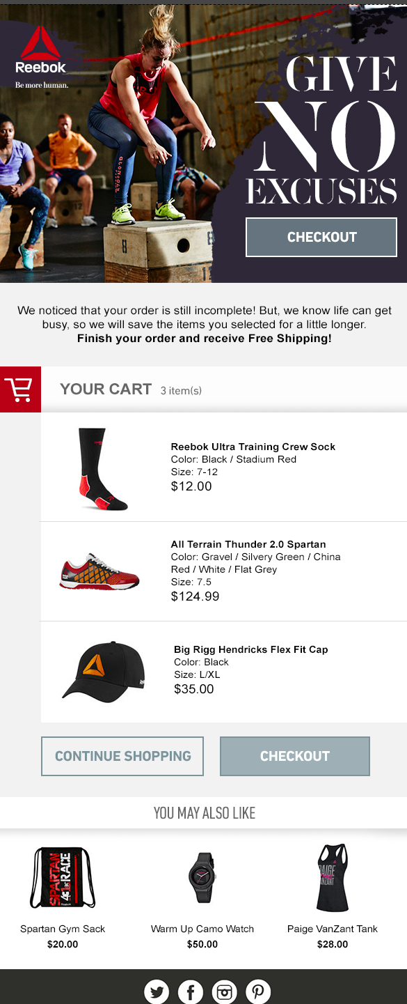
This principle also applies to cart and browse abandonment emails. Presenting the products customers had added to their baskets in addition to related items helps to narrow the choice for customers.
Key Takeaways
As with any theory, or best practice in retail, it’s important to approach choice paralysis with a critical eye. Yes – it can be an issue for e-commerce sites, but it’s important to use your own site and customer data to establish the extent of the issue, and whether there is a problem at all.
There are examples where too much choice can be something which prevents customers from making a purchase decision, and others where providing choice can actually help the decision making process. It’s all about the context.
Some of the potential problems can be solved by good design, simplicity being a key factor. Pages with a single goal, less-cluttered pages and more simple and relevant emails can all help.

Reviewed by Brad Ward
Written by Graham Charlton
— Updated on 11/08/2022
NEW EBOOK
⬛️ 2023 Black Friday Ecommerce Strategy & Stats Report
This FREE ebook gives you the methods, solutions & trends for building a high-converting remarketing strategy for Black Friday

Speak to an expert
Learn how to convert your online audience into revenue with our experts.

Graham Charlton
Graham Charlton is Editor in Chief at SaleCycle. He's been covering ecommerce and digital marketing for more than a decade, having previously written reports and articles for Econsultancy. ClickZ, Search Engine Watch and more.


![Valentine’s Day Ecommerce Tips and Trends [2024 Strategy]](https://www.salecycle.com/wp-content/uploads/2019/01/valentines-ecommerce-1.png)


![How SaleCycle helped Vodafone increase their online sales by an additional 2,000 additional sales per month [Extended Version]](https://www.salecycle.com/wp-content/uploads/2023/08/vodafone-banner.webp)