
SHARE


In this post, we present some useful tips for optimising the ecommerce checkout process to reduce cart abandonment. With ecommerce cart abandonment at around 81%, it’s important for ecommerce sites to do what they can to reduce cart abandonment, and deal with many of the issues that cause customers to leave. Here are some of the common issues that can contribute to checkout abandonment, and the best practices for dealing with them.
What Is An Ecommerce Checkout Flow?
Ecommerce checkout flow is the process of buying items within a shopping cart. When an online shopper adds an item to their digital basket they will then attempt to complete their purchase. To get to the end the user must input details such as delivery options, making a payment, filling out a form and signing in or registering for a guest checkout these steps make up your checkout flow.
However, these steps in your checkout flow must be optimised for user experience. For example, some users may want to use a certain payment option or might be in a rush and have no time to sign up to your website, which is where a guest checkout can help. These stages in your customer’s buying journey is your checkout flow.
Your ecommerce checkout flow is where you will convert your customers. Buyers with intent will enter your checkout flow to complete their purchase, if this isn’t optimised they could abandon. Any small design error can be significant in losing sales, but also, any small design improvements like CTA buttons can aid user experience can also increase online sales.
Key Checkout Process Statistics
- overall cart abandonment rate is 81.08%
- 23% of customers have abandoned a purchase because they had to create an account
- add-to-cart rates on desktop 4.35%
- add-to-cart rates on mobile 8.96%
17 Best Practices To Improve The Checkout Process
According to SaleCycle data, the average cart abandonment rate for all sectors is 81.08%. During in the best days for ecommerce sales it’s vital to convert the users showing intent. Improving your checkout process is one step towards improving your overall conversion rate optimisation strategy.
Offer Guest Checkout
Guest checkout speeds up the process by avoiding the unnecessary step of forcing customers to register before beginning checkout.
Indeed, a SaleCycle survey found that 23% of customers have abandoned purchases because they had to create an account first.
Instead, a guest checkout option gives customers the option to enter an email address and head straight to checkout. It means customers start to complete address and payment details more quickly and makes the process seem like less work.
Some sites (Bellroy is one example) send customers straight into checkout forms from the shopping cart page, but a more common approach is to offer the option of guest checkout, login, or registration.
Some, like Crate&Barrel, don’t even offer registration, instead telling new customers that they can create an account later if they wish.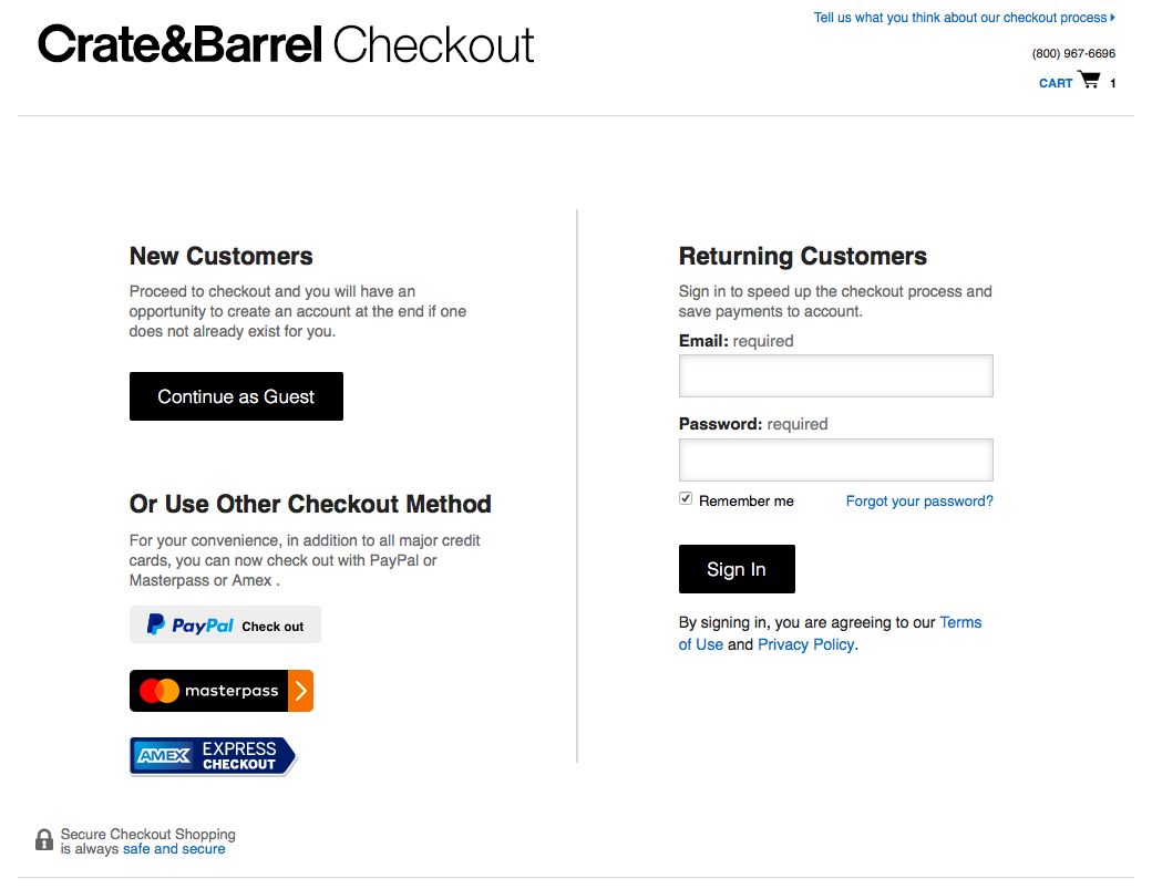
Make It Easy to Reset Forgotten Passwords
For repeat customers, checkout can be nice and easy when address and payment details are saved. If they can remember their username and password that is.
If not, many sites will not allow customers to create a new account, or to checkout as a guest with an email address they’ve used before.
Passwords can be hard to remember. We prioritise the key passwords and codes like banking logins, favorite websites, social media accounts etc, but we don’t necessarily remember which password we used when we bought a shirt six months ago.
Resetting passwords is a pain, as it slows up the checkout process, and often requires a number of steps.
The key is to make it as smooth as possible for customers. Often, it’s a case of emailing a reset link, but alternatives like password hints can save time.
Here’s an example reset password flow from inchoo, which is reasonably smooth, as long as rest emails are sent promptly.
Use Progress Indicators
Progress indicators tell customers which stage they are at in the checkout process, and how much there is to do to complete a purchase.
It’s a useful visual reminder for customers, and helps to reassure them that the process won’t take long, or perhaps that they’ll have a chance to review the order before confirmation.
Focus on Mobile Checkout UX
Checkout can be harder on mobile, so retailers need to work harder to remove any unnecessary friction.
Big thumbs and small screens can cause accidental clicks, which waste time and lead to frustrated users, so it’s important to minimise this risk.
So form fields, CTAs, and form fields need to be the right size, and given enough space so that fields and links aren’t too close together. It’s also important to note that the majority of online users will browse and buy on mobile. For example, online traffic on mobile accounts for 68% of all traffic, while online sales on mobile accounts for 56%.
Retailers can also make mobile checkout easier by tapping into device-specific capabilities like using the smartphone camera to scan payment cards, and showing the best keyboard for the form field.

Provide a Summary of Cart Contents
Showing the contents of the order and the total costs provides a useful reminder for customers.
A summary helps shoppers to see that their order is correct before they finish the checkout, and also means they don’t have to leave the checkout to check anything.
This should be shown on every page of checkout, and should include the total price including delivery and any extras.
Use Visuals to Make the Process Easier
Visuals can often convey information more quickly and efficiently than text, and can also make checkout forms seem less like hard work.
A visual connection between the checkout pages and the rest of the site helps to establish credibility – if the checkout page looks like the rest of the site, it feels safe and like it belongs to the site.
Visuals can also convey key information. For example, images of basket contents offer a quick reminder for users which is easier to digest than text.
Consider Offering Social Sign In
Social sign ins are offered by many ecommerce sites, offer an easy alternative to registration, and can speed up the checkout process.
They can also help to avoid problem with passwords, as users are more likely to remember social logins that they use regularly.
On the flip-side, some retailers may feel uneasy about a third party site controlling customer data. Still, retailers like ASOS feel the advantages outweigh the disadvantages.
Test and Review Regularly
The checkout process is never perfect, and should never be considered the finished article.
Changes in technology and customer expectations mean that the checkout user experience is constantly evolving, and retailers need to keep pace.
Data should be reviewed regularly, but retailers need to carry out regular UX tests, observing customers as they use checkout to uncover any sources of friction.
Use Address Shortcuts and Validation
Tools which aid address entry perform two useful functions – they make it faster and easier for shoppers, and ensure that addresses are accurate.
They take a number of forms, the most common is asking customers to enter a house number and postcode before searching for the address.
One alternative is to use address predictor tools, which suggest matching addresses as shoppers type.
Enclose the Checkout Process
When entering checkout on many ecommerce sites, the header bar and navigation links are removed and the page is more stripped down than the rest of the site.
Here’s one such example from Bellroy. The only visible link that will take shoppers out of checkout is the ‘continue shopping’ button. All others are in the site footer.
This means customers can concentrate on completing checkout without any distractions, while ensuring that information they need (on shipping for example) is more visible.
Use Clear Calls to Action
Calls to action during checkout are there to indicate to people which steps they should take to move on to the next stage.
As with all CTAs, it’s important that these key links stand out from the rest of the elements on the page. Color and size can be used to create a contrast, as Monsoon does here.
Use Microcopy to Guide Users Through Checkout
Small pieces of copy (often referred to as microcopy) can help to make checkout easier to complete, and pre-empt possible errors from customers.
For example, a sentence placed next to the password field can explain what’s required and helps to ensure that passwords chosen are in the correct format.
Clear Error Messaging
It’s great to pre-empt and therefore avoid common errors, but shoppers will always make the occasional mistake when completing checkout forms.
Error messages should:
- Explain clearly what the problem is, and how the shopper can fix it.
- Be polite. However silly the mistake, blaming the shopper won’t help.
- Be placed near the relevant field. This draws users’ attention to the error at the point where it can be corrected.
This is a good example from booking.com, which highlights the field, pre-empts a possible error and suggests a correction.
Watch out for Those Discount Code Boxes
Discount codes are a big part of online shopping, and a common tactic used by retailers for customer acquisition.
The result is that many checkouts or shopping cart pages now contain a coupon code box. This is great for customers with codes to use, but for those with no code it’s a sign that they may be missing out on a better deal.
Having seen the code box they may head to Google and search for codes, and they may not return to complete the purchase.
To minimize this problem you could offer customers a standard discount code, perhaps promoting it next to the code box.
Another alternative, used by Schuh, is to move the box to a less prominent place. Those customers that have a code will find it but others may not notice it.
Offer Alternative Payment Methods
Ecommerce payment preferences are more varied than before. Debit and credit card payments are still popular, but many alternatives have emerged in the last few years, while preferences can vary a lot between different markets.
Retailers face the challenge of keeping up with customer preferences so they can appeal to as many shoppers as possible.
Ecommerce sites can’t necessarily offer every possible payment option, but by providing choice they can cater for most preferences.
Sears does a good job here, with four different payment options, in addition to its own credit card.
Alternative payment methods have the added bonus of speeding up checkout for users.
With saved payment and address details, methods like PayPal, Amazon Checkout and Visa Checkout mean that customers can just enter a username and password and avoid 90% of the form filling.
This is great for mobile too, as it reduces the effort required. It can be even simpler on mobile too, thanks to methods like Google and Apple Pay.
Address Any Security Concerns
Some customers may begin to worry about security during checkout so it can help to offer a little reassurance. In general, a site that looks good and is easy to use will allay many fears, but there are other ways to offer reassurance.
For example, showing clear contact details during checkout tells customers they can get in touch if they have any issues.
This could be live chat, as in this example from Schuh, or simply a clear contact number.
Some sites also choose to display security trust marks from brands like Norton and Verisign. This can help to improve customer confidence, especially if they haven’t heard of your brand before.
Invite Shoppers to Register at the End of the Process
Guest checkout options are great to remove barriers at the beginning of checkout, but there are still benefits to registration, for customers and retailers.
For the customer, registering helps them to log in and track or amend orders, and with saved billing and payment details, makes repeat purchases much smoother.
Easy repeat purchases benefit the retailer too of course, while accounts allow them to send marketing emails after purchase.
The key is to avoid registration as a barrier by presenting it later in the process, once the customer has entered address and payment details.
Lowe’s is a good example of how this can be presented. Returning customers can log in, but guests are advised that they can create an account later on.
Then, towards the end of the process, customers only need to choose a password to create an account.

Reviewed by Brad Ward
Written by Graham Charlton
— Updated on 25/08/2021
NEW EBOOK
⬛️ 2023 Black Friday Ecommerce Strategy & Stats Report
This FREE ebook gives you the methods, solutions & trends for building a high-converting remarketing strategy for Black Friday

Speak to an expert
Learn how to convert your online audience into revenue with our experts.

Graham Charlton
Graham Charlton is Editor in Chief at SaleCycle. He's been covering ecommerce and digital marketing for more than a decade, having previously written reports and articles for Econsultancy. ClickZ, Search Engine Watch and more.


![Valentine’s Day Ecommerce Tips and Trends [2024 Strategy]](https://www.salecycle.com/wp-content/uploads/2019/01/valentines-ecommerce-1.png)


![How SaleCycle helped Vodafone increase their online sales by an additional 2,000 additional sales per month [Extended Version]](https://www.salecycle.com/wp-content/uploads/2023/08/vodafone-banner.webp)