![What Is Call To Action (CTA)? – 6 Strong CTA Examples [2023]](https://www.salecycle.com/wp-content/uploads/2019/11/ecommerce-calltoaction.png)
SHARE


When your online visitors are ready to make a booking, a purchase, or any other conversion, it’s essential that the next step in the sales funnel is clear.
Effective CTA implementation and design is about finding – and testing – the right combination of elements to ensure that shoppers have no difficulty in continuing with their ecommerce customer journey, and in turn, reduce cart abandonment rates.
In this article, we’ll look at the key aspects of CTAs to consider when designing your next campaign or optimising your landing page, to improve your digital marketing and conversion rate optimisation strategy. We’ll also cover the best A/B testing practices to use when monitoring the success of your CTAs.
What Is A Call To Action?
A call to action (CTA) is a marketing prompt on a website that tells a user to take a specific action. A CTA can have a direct link to a sales component or it can simply move the user further along the customer journey to becoming a customer of the company. A CTA is usually written as an action or command such as ‘’Sign Up’’ or ‘‘Request A Demo’’ and is in a button and hyperlink format.
A call to action (CTA) or CTA button in ecommerce should make it clear to online users what the next step in their journey will be. This could be to add an item to their online shopping cart, sign up to a subscription or perhaps complete the purchase.
What Is The Goal Of A Call To Action?
A CTA or call to action is a core element on a webpage that acts as a stepping stone to what the user should do next. For example, think of a CTA as a signpost, without clear direction the user may not understand where to go next to complete their purchase or sign up to an ecommerce newsletter. A strong ecommerce CTA can help to increase conversions, by offering clear signposts to users.
Why Is CTA Important?
It’s important to remove any friction from the user journey to push them further down the sales funnel. Of course there can be multiple calls to action on each webpage with different wording, sizing, colour and links. There’s no perfect formula for a CTA. What works for one site may not on another, but whatever the size, shape, wording or colour, a CTA works as one of the main driving forces in directing a visitor to making a desired action – such as ultimately completing a sale.
One of the risks of not adding a CTA on a blog post, on the other hand, is that the user may leave the site without completing this desired task. This means your bounce rate and page exit rates may increase – when the main goal in ecommerce is to get your users to go deeper into your site and browse more pages without higher rates of browse abandonment.
What Makes A Strong CTA?
A strong CTA signposts and drives people to take action – whichever the business’s goal. Although the concept seems simple, creating effective CTAs isn’t always straightforward. While you want your CTA to stand out, you also want to avoid appearing too desperate and purely sales-driven.
In this case a strong CTA is all about intention, or tone of voice. The most impactful CTAs use terminology that provokes emotion and/ or enthusiasm, which drives the individual to take action – If your CTA is enthusiastic, then your consumers will be enthusiastic too.
What 3 Elements Should Be In A CTA?
Before we explore some key CTA examples, it’s important to recognise the following three key principles when creating your next marketing prompt:
1. Placement
Placing your CTA where it can be seen clearly and effectively used is paramount. In an ever-growing technical world, users are aiming to spend less and less time carrying out online tasks. It has been found that user attention spans waver from as little as under 8 seconds onsite. So, it’s important that your CTA is in an obvious place on your site to avoid bounce rates.
1. Functionality
This may seem obvious – but your CTA needs to look (and certainly be) clickable. If your CTA doesn’t look like a convincing prompt, users may miss the opportunity to follow the link. This is why a button format is widely used as it encourages the visitor to click.
Regularly checking your site’s functions, such as directories and website speed, can help you to avoid any technical mistakes that could encourage your website visitors to abandon.
3. Clear Copy
Keep the written element of your CTA short and simple, with a sense of urgency in turn. The user should be able to understand what they can/ will gain from committing to your CTA, so the length and terminology should be precise and brief.
What Is An Example Of Call To Action?
A website CTA can include any task that you want the user to take. A call to action can be placed anywhere on a webpage and can lead the user to a specific area of the website. For example, each CTA can be a button on a blog post like a demo or newsletter, a hyperlink in an email (for example, a post purchase email) or a social media icon. Below are some examples of where CTAs can be utilised across ecommerce sites:
Call To Action (CTA) Examples For A Blog:
- Sign up to a newsletter
- Download an ebook
- Get a demo
- Share on social media
- Read more articles
Call To Action (CTA) Examples For B2B:
- Get a demo
- Book a meeting
- Contact sales
- Free trial
- Sign up
Call To Action (CTA) Examples For Ecommerce:
- Add to cart
- Buy now
- Checkout
- Add to wish list
- Shop the sales
- View more styles
Ecommerce CTA: 6 Best Practices
With all of the previous information and findings taken into account, we have compiled 6 of the strongest best practices for you to attain when producing your next CTA to address visibility, functionality and social proof (or consumer preferences).
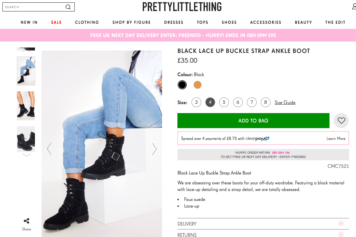
1. CTA Size
Calls to action shouldn’t be too subtle, so make them big enough to catch the attention of your shoppers. It makes sense for them to be the largest button on the page, to help it stand out from the background and underline its importance.
The CTA size will also depend on the device, such as desktop or mobile. There is also a size difference between webpage CTAs and email CTAs. For example research by Apple say ‘CTAs in mobile UI should be at least 44×44 pixels, and Microsoft recommends 34×26 pixels’.
2. CTA Colour
The choice of colour used on a CTA can help to make it stand out on a page. There’s a lot of talk about colour psychology and how the choice of colour can affect whether someone clicks. Certain colours are said to have different connotations and can increase or deter clicks.
However a main CTA colour best practice is to make sure the button and background colours are contrasting so the call to action stands out from other elements on the webpage. You can increase your conversion rate with a high button colour and background colour contrast.
The more likely effect of colour choice is in how it matches brand design, and how the contrast between CTA and background helps to catch the customer’s eye.
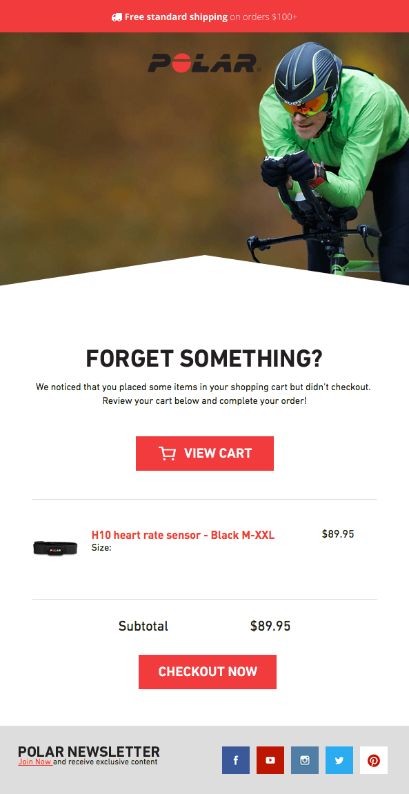
In this example from Polar, the contrast of the red CTA against a white background makes it unmissable. And below, Hertz changes CTA colours to ensure contrast with the background, ensuring that the calls remain visible.

3. Wording of CTAs
This is about clarity. People scan pages and absorb information quickly so the purpose of the CTA needs to be conveyed in just a few words, the less the better. This is why CTA microcopy is essential and should be ”snackable” and scannable yet still catch the attention of your users.
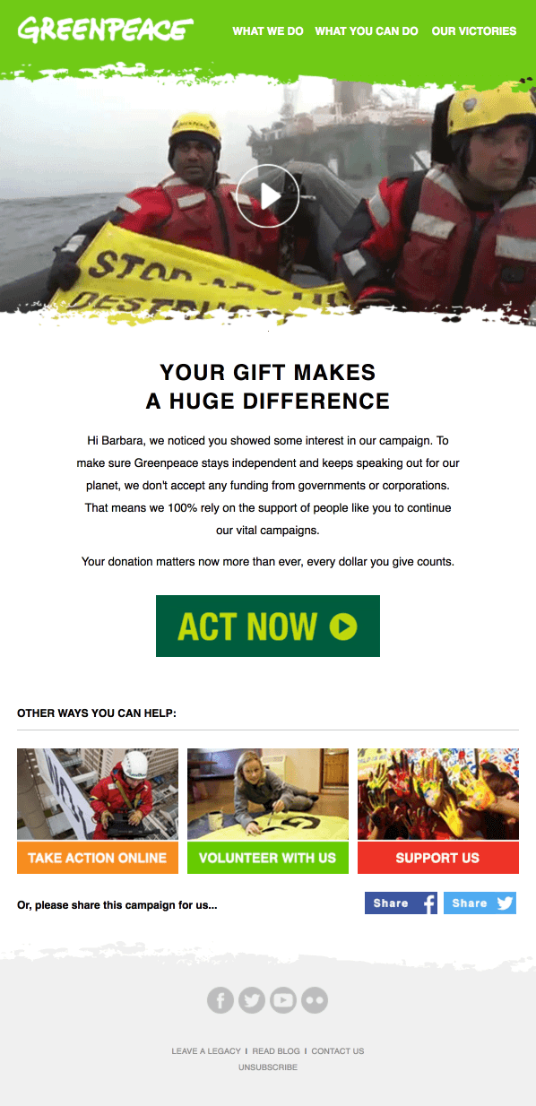
In the Greenpeace example below, ‘ACT NOW’ works as it matches the topic and gives the CTA added urgency.
In other cases, it helps to use wording that describes what the CTA does, such as ‘proceed to checkout’, ‘book now’ or ‘add to bag’.
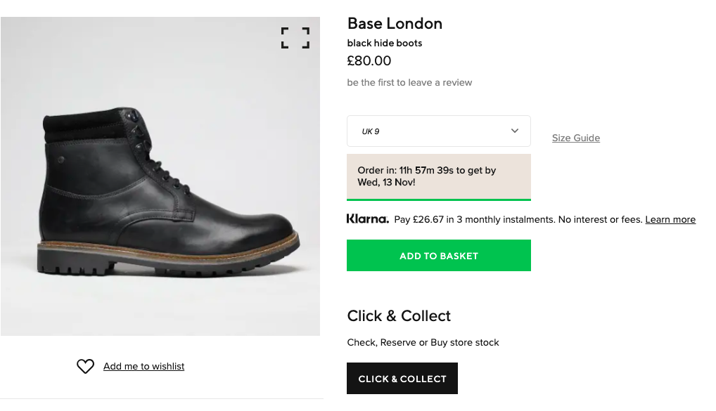
4. CTA Placement
Exactly where you choose to place a CTA can affect how noticeable it is.
Many ecommerce sites now use multiple CTAs to ensure that shoppers can see them no matter where they are on the product page.
This can help when some ecommerce product pages are long and detailed. Some Amazon pages contain 10 or more calls to action, some repeating the original CTA, others for product bundles or cross selling options on the page.
Another option is to have a sticky CTA which shoppers can view as they scroll further down the page.
AO.com has used this technique, so shoppers can choose to add items to their basket when they’re ready, perhaps after checking out reviews from other customers.
5. Use Large Mobile CTAs
For mobile sites or apps, CTAs need to pass the ”thumb test”. That is, they need to be easy to tap without the user making an error.
It helps to make them large enough to be unmissable, as well as ensuring they’re far enough away from other links.
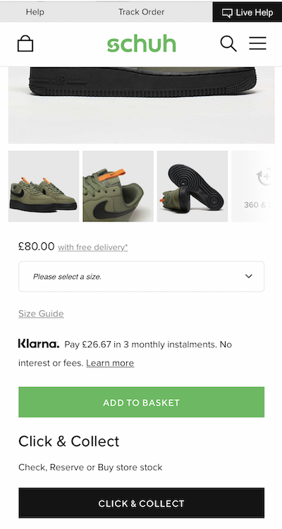
6. Show Key Messages Around CTAs
The CTA is designed to capture the shopper’s attention, and so this makes it a useful place to add key messaging.
This could include:
- Size guides.
- Delivery and returns information.
- Stock indicators and other product trends info.
- Alternative payment options, such as instalments.
- Urgency information. Countdown timers can be used to highlight nest day delivery windows, sales end dates etc.
How To Use A/B Testing For CTAs
A/B testing your calls to action (CTA) strategy helps you make the most effective conversion rate optimisation choices. For example, each user or customer base responds to various CTA best practices differently. Sometimes you can be surprised at your A/B test results but the key is to create the right tests.
Some points to consider while testing include isolating your tests to one variable. Keep it simple and this will enable you to read the results better. You should also test the same sized segments because each customer segment can behave differently. And finally, make sure to create more than one test to get a holistic view of the test.

Reviewed by Brad Ward
Written by Graham Charlton
— Updated on 14/07/2021
NEW EBOOK
⬛️ 2023 Black Friday Ecommerce Strategy & Stats Report
This FREE ebook gives you the methods, solutions & trends for building a high-converting remarketing strategy for Black Friday

Speak to an expert
Learn how to convert your online audience into revenue with our experts.
Brad Ward
Brad Ward is the SEO & Content Manager at SaleCycle. Brad is a former magazine journalist with over 8 years experience in digital, including SEO, social media and copywriting. Brad has written thousands of articles for a range of different sectors including online gambling, travel, education, sports and ecommerce.


![Valentine’s Day Ecommerce Tips and Trends [2024 Strategy]](https://www.salecycle.com/wp-content/uploads/2019/01/valentines-ecommerce-1.png)


![How SaleCycle helped Vodafone increase their online sales by an additional 2,000 additional sales per month [Extended Version]](https://www.salecycle.com/wp-content/uploads/2023/08/vodafone-banner.webp)