Microcopy can have a significant effect on the user experience. It can guide users through to the next stage of the purchase funnel, help them to complete online forms, or address customer concerns where they are likely to occur. Well-written and targeted microcopy can be a solution to several potential causes for cart abandonment. For example, a line or so of text can explain how to enter payment details and remove any confusion for shoppers.
In this article, we’ll look at the role microcopy in UX can play to smooth the ecommerce customer journey, and help to guide users to the checkout process.
What Is Microcopy?
Microcopy refers to small pieces of copy used on your website and can also be found when researching other applications and/ or products online – such as the small pieces of copy used around the site for reasons like context, guidance and reassurance.
These normally consist of just a few words, or perhaps a sentence or two. When used effectively, they can help to address customer concerns and make websites easier to use.
Examples of microcopy include:
- Error messages.
- Explainer text around form fields.
- Text on calls to action (or ecommerce CTA).
- Instructions on payment entry.
- Messages advising of stock levels.
- Reassurances about marketing consent.
Why Do We Use Microcopy?
Microcopy can be utilised as a guide in the customer journey when users take specific actions, such as researching products or trying to navigate certain areas of a website. In return, microcopy can build trust and confidence with your brand and build a better brand presence, resulting in repeat purchases and key ecommerce questions being answered – such as how and when do people shop online.
Microcopy can be used for a number of reasons within your site, and can target these three areas of your user journey (UX):
1. To Pre-Empt and Avoid Common User Mistakes
Certain form fields can trip users up more than others, and it pays to identify these fields through testing and analytics. Once you have identified problem areas, the answer may be to redesign that element, but the use of copy can often solve the problem.
For example, if you have lots of errors from customers entering passwords in the ‘wrong’ format, then a piece of text explaining the password requirements can pre-empt the issue.


2. Make Forms More Conversational
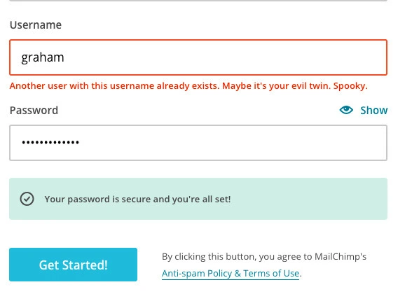
The teams behind websites tend to have their own internal terminology, but this isn’t necessarily a language that customers will understand. The use of more natural copy can make the process more human, and fun, for users. It can make error messaging more friendly, and even amusing, as in this example from Mailchimp.

3. To Reassure Users About Marketing Consent
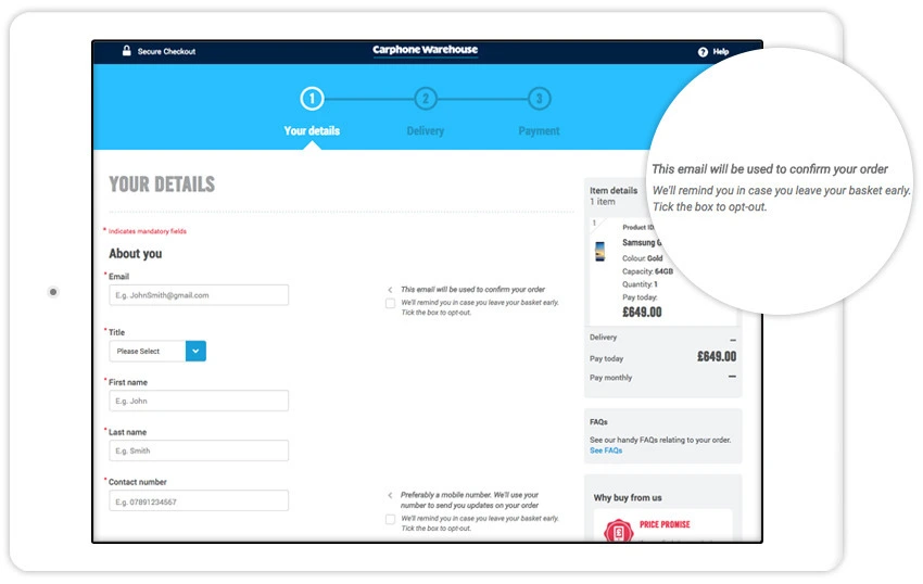
In a post-GDPR world, and with Google removing cookies, it’s important to ensure that customers make clear and informed choices when entering sufficient contact data. For example, our Marketing Permissions Service uses microcopy to gather consent for marketing, and to explain to shoppers how their contact details will be used.

Why Is Microcopy Important?
Microcopy can play an extremely important role in your customers journey, no matter their place in the sales funnel, as it can be used as a clear and instructive guide on route to the checkout process. Microcopy works alongside customer behaviour prediction, and assists when consumers are taking certain actions when they make their way around a site, so harnessing this practice and using microcopy to your advantage can help to deter attention away from other sites online.
How To Use Microcopy?
It’s important to know how to utilise the correct mode of microcopy for the most impact, with your brand’s tone of voice in mind. Brad Ward, SaleCycle’s SEO and Content Manager and microcopy specialist says:
”Short content creates a big impact. This is called microcontent. Headlines, email subject lines, summaries, social media posts and so on. This messaging should be concise and scannable and use plain language, which can be understood with zero context. For example, a headline is the first piece of content people read. Often, it’s the only piece of content users read before making a judgement about your brand.”
“The best headlines sum up the content and can be understood within 5 seconds. Users should understand what your brand does, what product or service it sells and all other relevant information just by reading the headline.”
In reflection, the following four factors are essential when writing and placing effective microcopy around your site:
- Brevity: The idea is that copy is short enough to be read (or scanned) quickly and understood by users. If it becomes too long, people are less likely to pay attention.
- Placement: The point of microcopy is that it is placed in the exact spot where users need the information it conveys, such as next to a form field or call to action.
- Action: Microcopy is often instructing people on the actions they need to take (how to complete a form field for example) or providing information which helps them to decide on an action.
- Authenticity: Microcopy is there to inform and help shoppers, not to trick them or shame them into taking a course of action (as in this somewhat extreme example).
13 Best UX Microcopy Examples For Ecommerce
1. Confused.com
Insurance forms can be long and time-consuming, so it pays to make sure fields are clear for users to minimize form abandonment. Also, as incorrect information can invalidate insurance policies, it’s important that users are given plenty of assistance.
There are two examples below from Confused.com. The first offers reassurance to people who may have concerns about receiving marketing calls if they provide their number.
The second addresses a common problem on insurances forms: finding the correct job title. Often tricky, unless you have an easy to explain and understand job title such as nurse or teacher.

2. Wiltshire Farm Foods
This site delivers ready meals to a (generally older) customer base, and for this reason it can help to use copy to explain form fields and other site features as clearly as possible.
Reassurances about site and transaction security are also valuable. So, on the payment page, there’s some text to explain that the site and the payment process is totally secure. Placed at the point of payment, this can be effective in dealing with any last minute concerns.

3. Trello
Text used inside form fields can quickly explain what users need to do. Here Trello provides examples to illustrate what’s required in each field.

4. Threadless
This is a fun example from Threadless, which simply confirms that an item has successfully been added to the customer’s cart.
It’s also a piece of copy which is on point with the brand’s tone of voice.


5. House of Fraser
It may seem to some that House of Fraser is stating the obvious here, but it doesn’t hurt to make it clear. The microcopy here should ensure that no customer is in doubt about the information needed to complete payment.

6. Lovehoney
Lovehoney sells adult products, the kind of things people may be nervous about ordering.
Copy like this about packaging and how the transaction will show on bank statements can help to reassure potential buyers.


7. Luminosity
This example, found on little big details, shows how microcopy can help to convey a particular tone of voice. The language here is more personal, and stands in contrast to that used of most sites.
It’s also very helpful, confirming that my password is suitable, and alerting me to a mistake made when entering my email address. Microcopy can pre-empt and avoid users making errors when completing forms, but can also help to address them more easily once made.


8. AO.com
Text added to the search box can prompt users to search for specific products, or just give them a general idea of how to use the site search function.
Here, AO suggests products and brands, but also alerts people to the fact that they can find advice this way too.

The next example from AO answers possible questions shoppers may have about delivery, and the reassurance that they won’t have to stay in all day can be a great selling point.

9. flydubai
Here’s an example from flydubai, an on-site remarketing message which appears as users are about to abandon a booking.
The copy advises them that other people are considering this flight, and they may miss out if they leave ( a nice use of urgency), but also offers the useful option of emailing them with the flight details so they can complete the process later.

10. Virgin Atlantic
Virgin uses this sentence of copy to inform visitors that the quoted price is exactly what they’ll pay when they checkout, with no hidden extras.
It’s a useful piece of copy that reassures visitors at a key stage in the checkout.

11. Gofundme
This is a great use of copy to manage expectations around customer service, advising customers when they can expect a response.

12. Crate & Barrel
Crate&Barrel sensibly offers guest checkout to customers who would rather not register upfront, but uses the copy here to explain that they will be given the chance to create an account later on.

13. Booking.com
Booking.com uses a lot of microcopy on-site, to help users through the booking process, and to reassure customers about the booking. As shown below, Booking.com reassures me that I can cancel this booking free of charge – a piece of copy that can be enough to persuade people that they can complete the booking without fully committing.

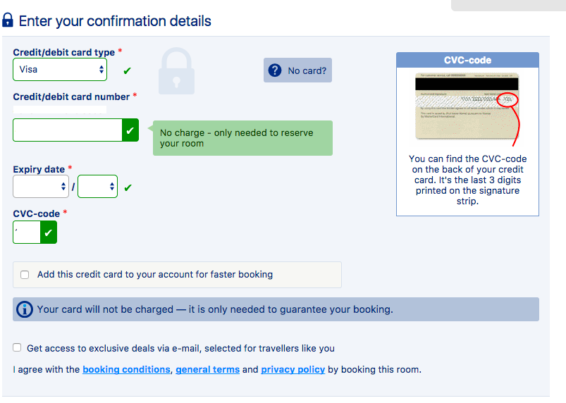
The next example comes on the payment page. The booking terms were payment on arrival, so people will naturally wonder why the site asks for card details.
Microcopy is used to reassure customers that the card won’t be charged, and that it’s only needed to guarantee the booking. A simple piece of copy like this can be the difference between customers abandoning and completing a booking.

What Is Microcopy in UX?
Microcopy is an imperative part of UX which refers to the tiny pieces of text around your website. Although these small descriptive areas seem like a small – and perhaps insignificant – part of the overall interface (and UX), microcopy in UX is key to help direct the visitor to take the desired action.
What Is UX Writing?
Improving UX, or user experience, can be combined with writing and microcopy when the text relates to helping or informing the customer at a convenient time to help them along the sales funnel – when written well, taking into consideration behavioural segmentation and audience participation.
As mentioned, UX microcopy can be found at any points around the website but can also be used for other applications or product pages in order to enhance the user experience.
What Is The Difference Between UX Writing And Microcopy?
Although UX writing and microcopy can work hand in hand in your ecommerce strategy, the main difference between the two is their use – or scope:
- Microcopy defines text that is used to inform the user of their journey throughout their visit (being utilised in multiple areas of the online platform), so is a broader end-to-end practice when building your site.
- In comparison, UX writing is a much more narrow category in terms of its use. UX writing is much more descriptive and product-focused, and is used to detail the specific topic of the user journey in order to make the user experience more immersive.
Why Is UX Copywriting Important?
All in all, UX copywriting/ microcopy improves and elevates the UX process, resulting in better conversion rates for your brand. By using an A/B testing strategy, you will be able to test which mode of text is most suitable for your brand and it’s consumers, and see the difference this mode of sign-posting makes as part of your UX.
Well-informed interaction throughout your brand is key, and UX microcopy is one of the key ways you can provide that to help in the decision-making process. Your users need to be constantly assured (both overtly and covertly) that your products and/or services are the best choice for them with the use of intelligent descriptions and assistance.
Speak to an expert
Learn how to convert your online audience into revenue with our experts.


Casey Turnbull
Casey is a Fashion Journalism graduate & ecommerce marketing executive at SaleCycle. Casey is committed to producing high quality content backed by in-depth research and data. She has experience developing content in a range of sectors including fashion, ecommerce and sports.
![What Is Microcopy? – Your Ultimate UX Writing Guide [13 Best Examples]](https://www.salecycle.com/wp-content/uploads/2016/12/Banner.jpg)


![Valentine’s Day Ecommerce Tips and Trends [2024 Strategy]](https://www.salecycle.com/wp-content/uploads/2019/01/valentines-ecommerce-1.png)


![How SaleCycle helped Vodafone increase their online sales by an additional 2,000 additional sales per month [Extended Version]](https://www.salecycle.com/wp-content/uploads/2023/08/vodafone-banner.webp)


