Little design touches, key pieces of copy, and time saving tools all help to make the customer journey much smoother.
In this post, we’ve picked out some examples from around the web to show how attention to detail can make a difference.
It’s about thinking how people use sites, and adapting to their behavior. This, from Gmail, is an example of the kind of thing I mean. Google detects the word attach and adds this prompt to stop me sending the email without the promised document. The Gmail team have learned from user behavior, and this simple feature must have helped millions of users over the years.

In ecommerce, the same principle applies. By understanding customer behavior – how they use sites, the information they need etc – good UX can save user effort and make it easier for them to shop online.
Domino’s
Domino’s knows that most of its voucher codes are in capitals, so it serves up the uppercase keyboard for users.
It saves time when entering voucher codes and makes it more likely that customers will complete their orders.

Booking.com
Booking.com fits a lot of useful and persuasive information into its listings and product pages.
In this example, the reassurance that hotels can be cancelled later (and are therefore risk free) is a persuasive piece of microcopy.

Trainline
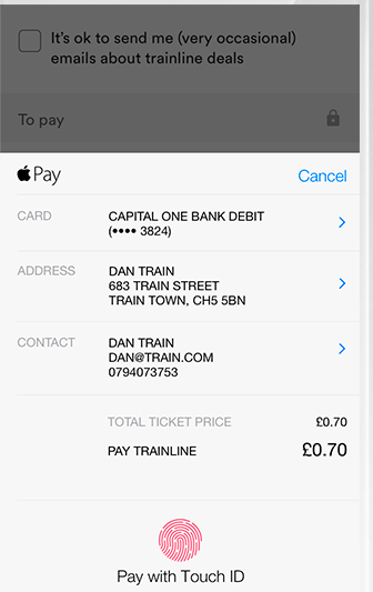
For users on the move, booking on mobile, payment can be a tricky business.
Trainline sidesteps this neatly with the option to use Apple Pay to complete the booking, reducing checkout to a quick use of Touch ID.

Nixon
This effect when shoppers mouseover the product images in search results, they can quickly see the different face and strap combinations.
It helps people to view products more easily, and to narrow their selections more quickly.

Confused.com
Car insurance quotes can take some time to complete, and it helps to make form fields as easy as possible to understand.
Confused.com uses some handy tool tips to explain certain form fields, why some questions are asked, and where to find certain information.
Using images, it shows exactly where users can find their driving licence number, saving them time and ensuring that the correct data is entered.

Zappos
Zappos uses survey data from customers to provide more detail on the fit of its shoes, a useful way to help customers choose the right product, and to reduce returns.


Autoglass
Autoglass uses text and images to take the user through the process of booking windscreen repair and replacement.
The form is simple and easy to complete, and the examples (is it smaller than a £2 coin?) are an excellent way to simplify the questions and make the customer journey much smoother.

Simply Chocolate
This scrolling page on Simply Chocolate is a great piece of design, and looks fantastic.
It’s also great UX, as it’s easy to scan through the product range and get all the information you need about the products.

Hotels.de
This is about making customer journeys easier by reducing the amount of effort required from them.
The address look up tool begins to guess the shopper’s address as they type, saving the user effort and helping to reduce errors.

Easyjet
Here, EasyJet has a passport scan feature which can scan and populate the customer’s passport data in less than 20 seconds.

Home Depot
Home Depot uses icons and diagrams brilliantly here to convey key facts about a gas barbecue.
Little details like showing grill capacity in terms of hamburger patties is an excellent way to convey this information.

AO.com
For electronics products such as laptops, key information such as the number and type of ports are key to shoppers.
Multiple images like these used by AO, gets that information across quickly and help people to decide on a purchase.

Speak to an expert
Learn how to convert your online audience into revenue with our experts.
Graham Charlton
Graham Charlton is Editor in Chief at SaleCycle. He's been covering ecommerce and digital marketing for more than a decade, having previously written reports and articles for Econsultancy. ClickZ, Search Engine Watch and more.
![12 UX Features That Help to Improve the Customer Journey [Examples]](https://www.salecycle.com/wp-content/uploads/2018/09/ecommerce-ux.png)


![Valentine’s Day Ecommerce Tips and Trends [2024 Strategy]](https://www.salecycle.com/wp-content/uploads/2019/01/valentines-ecommerce-1.png)


![How SaleCycle helped Vodafone increase their online sales by an additional 2,000 additional sales per month [Extended Version]](https://www.salecycle.com/wp-content/uploads/2023/08/vodafone-banner.webp)


