Here we present a selection of product pages from retailers, with some examples of great design, use of imagery, and some key features that make these pages more effective.
I’ve picked out these pages for various reasons. Some are just very good all-round (like Joseph Joseph), while others have one or two excellent or innovative features (Rezin, Away).
What Is An Ecommerce Product Page?
An ecommerce product page is a page on a website that defines a product and its features in its entirety. This includes features like price, sizes, specs, colour, manufacturer and more. An ecommerce product page allows the customer to look into what the product offers and provides a comparison to other similar products. This page facilitates the overall buying process.
Why Is Ecommerce Product Page Design Important?
Well-designed ecommerce product pages convey the value of the featured product while offering a great user experience. It’s essential to create the best product pages because the user will make a critical decision on this page, which is whether to purchase or not. Including conversion rate optimisation best practices and UX features can increase conversion rates on your product pages and therefore improve overall revenue of the website.
15 Best Product Page Examples
Away
This product page is excellent at showing and explaining the products, and selling their key benefits.
Here’s one example. The description provides a link for shoppers who need to decide whether they need an ejectable battery.

The site then shows this overlay to explain the pros and cons of each option clearly.

The suitcases are relatively expensive so the page needs to work hard to explain to shoppers why this product is better than many of its competitors.
It does a great job of showing the product visually, firstly with a range of images and 360 views, and then through some GIFs which show how much you can fit in.

Finally, the reviews section is very useful, and Away has answered every single customer question about the product promptly, which gives a great impression.
Made.com
Made.com uses a great range of visuals, including video and 360 views, to showcase its products.
It’s very good with helping customers to find the right size furniture, with clear images like this, as well as a very handy ‘sofasizer’ tool.

The pages do lack consumer reviews but there’s some great social proof on the page with these user photos showing Made.com products in their houses.

Nordstrom
Nordstrom’s product pages have some excellent features. First of all, there are plenty of high quality product images.
There’s also videos on any of the product pages which feature in-store sales staff telling you why they like the product. It’s a nice touch which brings a little of the store experience online.

The cross-selling options are also worth mentioning. Most pages feature a good selection of suggested outfits using the viewed product.
Shoppers can scroll through a range of different looks, and add other options to their basket. An excellent way to cross-sell.

Modcloth
Modcloth’s product pages deliver on detail, with clear product information, but it’s the use of social proof that stands out.

At the top of the page, there’s an average review score and a figure for the number of likes the product has received.
Below, Modcloth shows photographs from customers who have bought the product. This is great, as it shows potential customers that other people have bought the product and are happy with it and the site.
It also gives them ideas for what to wear the skirt with – the photos expand to show to show the products (or similar ones) that are shown in the photo.

Further down the page, we have a comprehensive customer review section. Reviews are summarised effectively in charts showing average scores, product fit and quality, and the most useful positive and negative reviews.
The reviews themselves give some information on size and fit that should help potential customers find the size for them.

Ugmonk
This page is notable for the sheer level of detail and the range of great product imagery.

We have the basics of price, short description, shipping information above the fold, and a lot of detail further down the page.
It’s a long page which goes into detail about the product and process, and also presents some great imagery to help shoppers get a real feel for the product.
Shots like the one above help people to see the capacity of the bag, while others show the features and materials used.
It’s a really comprehensive page which uses imagery to great effect to sell the product.

Rezin
This is a really simple product page with some great imagery.

Rezin’s sunglasses are pretty expensive so they need to look great on the page.
I like the sticky bar which keeps the product title and price visible as you scroll through the images, while this gif shows how neatly the case folds up.

J Peterman
This site has an idiosyncratic approach to product page design, but one that fits in with its products and philosophy.
For example, no product photos are used, just drawings, but you still get a good idea of the products, and it fits in with the atmosphere of the page.

The page is relatively simple, but it’s the product copy that really stands out here.
It doesn’t follow the norm but tells a story around the products, though it does manage to describe some of the key points in the end:
“Working-Class Irish Pub Shirt (No. 1039), for men and women. Made of soft cotton sheeting, well-suited for both the intoxication of talk and the difficult art of listening. Not bad for just hanging out, either. Or, when necessary, for looking interesting.
Simple collar band. Seven-button placket. Stud at neck. No-nonsense. Rounded shirttails. Two-button cuff. No pocket. (You have to carry everything you have in your head.) Imported.
All nicely faded; they appear to have had some experience of life.”
Simply Chocolate
I’ve included this for the excellent scrolling effects and the clarity of information.
The design looks great, though this can often be easier to achieve for a brand with a single product or, as in this case, a few variations.
The scrolling product pages unwrap the chocolate bar as you go down the page. It looks great, and tells you what’s in the bar.

Beyond this, the page provides clear and detailed information on ingredients and calorie counts.
Burberry
Luxury brands have faced some challenges adapting to online retail, principally around how to convey that sense of luxury to web visitors.
I think the answer is providing a great user experience, as well as showing the quality of the products through great photography and copy.
Burberry does this well with a site that is easy to use, and clean product page designs and great product images.

Home Depot
Product pages on Home Depot, like this one for a gas grill, have some excellent features.

It’s a long product page for a relatively complex and expensive product, which aims to provide as much information as customers need to make a decision.
This includes detailed product specifications, questions and answers, and customer reviews, as well as a range of excellent product imagery.
Home Depot has also made the information easy to digest. The detail is there for people to read if they want to, but it’s also possible to absorb a lot when skimming through the page.
Above the ‘fold’, as shown in the image above, a lot of information is presented well. This includes price, average review score, key selling points, as well as information on local store availability.
Further down the page, this product summary is excellent. For example, describing the cooking space via the number of beef patties is a great way to get the information across.

The comparison table uses previous customer data to present similar products that other shoppers have compared. Great use of data, and a way to make product research easier for customers.

Joseph Joseph
This page has got it all, doing all it can to describe and demonstrate the product, its features and uses.
There’s great product imagery, showing it in action, as well as clearly displaying the contents of the box, as below. There’s also video further down the page.
Customers are reassured about returns and delivery, and a 2 year guarantee can help to remove any doubts.

We have some great social proof, with user submitted photos of the product. This has the effect of telling potential customers that other people have ordered without issues and that the product works well.

Reviews are great too, with a useful review snapshot showing product pros and cons and highlighting useful reviews.

Schuh
These product pages are a great example of adding all the features and information that shoppers are likely to need, while keeping it easy to digest.
Perhaps most importantly, Schuh has designed this page for mobile, making it equally easy to use on the smaller screen.


Mobile traffic passed that from desktop for Schuh back in 2015, and has continued to rise since. Having seen that growth Schuh took a mobile-first approach.

Whether you view it on mobile or desktop, Schuh’s product pages contain some excellent features:
- Multiple product images. You can see the shoes from every angle you need to in clear, zoomable images.
- 360 views. On mobile or desktop, you can rotate the shoes.
- Trust and reassurance. Schuh provides plenty of this, with clear contact number and a link to live help. There’s also messaging about easy returns.
- Delivery proposition. Schuh’s delivery options are pretty comprehensive and it gives them a prominent position on the product page. With free standard delivery, next day and click and collect, there should be an option to satisfy any shopper.
- Returns info. Fashion purchases are the most commonly returned items, so an easy and clear returns policy is important for retailers.
- Social proof. Schuh has reviews left directly by customers, and also uses Google Customer Reviews (shown at the bottom right) which measure performance around delivery and customer service.
- Check in-store stock. From the page, you can check local store stock before reserving for collection.


Harry’s
This is a great looking product page which has a clean design while managing to get the right amount of detail across about the product.

At the top of the page, the first shot clearly shows what’s in the package through the image (with text explanation further down).
It’s easy enough to do, but it’s surprising how many product pages don’t make this kind of detail clear.
There’s also some great reassurance which helps first-time shoppers (who may not have heard of Harry’s) that they can trust the site and make a purchase knowing they can return items if they need to.

ASOS
ASOS product pages are quite simple, as befits a site where the product ranges changes regularly.
It has a template that works though, conveying all key details that shoppers need to see products clearly and decide on a purchase.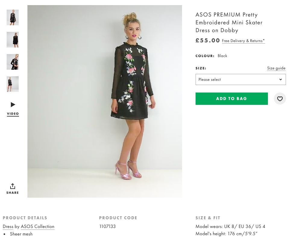

From the screenshot above we can see:
- Multiple product images so customers can see from a range of angles.
- Product videos.
- Clear call to action.
- Links to key information on delivery and returns. For shoppers that don’t click, the message is conveyed that both are free.
- Product details such as material.
- Information on the model’s size and the size of dress she is wearing. This helps customers to decide the size that will work for them.
AO.com
Plenty of detail here for shoppers. AO provides 11 different images showing the fridge freezer from all angles, and focusing in on details of the product.

There’s also a product video which talks viewers through the product and its uses, showing, for example, how much it can store. That’s a lot of peppers.

Further down the page, key information and features are presented clearly, allowing shoppers to scan and see information quickly.

I should also mention this clever feature from AO (also used by Curry’s) which cleverly anticipates the fact that some people will Google the product to see if they can find it cheaper elsewhere.

When a shopper copies the product title, this green box appears, offering to match competitors’ prices.
Speak to an expert
Learn how to convert your online audience into revenue with our experts.
Graham Charlton
Graham Charlton is Editor in Chief at SaleCycle. He's been covering ecommerce and digital marketing for more than a decade, having previously written reports and articles for Econsultancy. ClickZ, Search Engine Watch and more.


![Valentine’s Day Ecommerce Tips and Trends [2024 Strategy]](https://www.salecycle.com/wp-content/uploads/2019/01/valentines-ecommerce-1.png)


![How SaleCycle helped Vodafone increase their online sales by an additional 2,000 additional sales per month [Extended Version]](https://www.salecycle.com/wp-content/uploads/2023/08/vodafone-banner.webp)


