
SHARE


Lead Designer, Luke Nokes, presents some email design tips for marketers. There is a focus on cart abandonment emails, but the tips apply more generally.
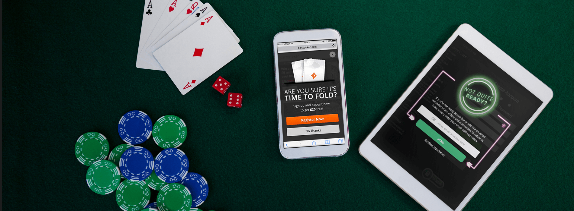
1. Clear CTA(s)
A call to action (CTA) button is the most important feature of any cart abandonment email.
They are an instant route back to a website (then hopefully a conversion!) and therefore need to be clear and obvious.

2. Make it Easy
Make your email easy to scan and read by using descriptive or interesting headlines to break up sections of content.
Make the intention of your email obvious (it’s okay to say “hey, buy my products!”) to avoid confusion and/or boredom.
[one_half]

[/one_half][one_half_last]

[/one_half_last]
3. Crisp Copy
Along similar lines to the previous two points, keep your copy crisp and to the point.
With the average attention span said to be less than 8 seconds, you have a small window to capture your audience. Bore them and they’re not sticking around.

4. Crisp Imagery
High DPI displays render imagery with twice the amount of pixels as normal.
This means that if you aren’t currently using retina imagery, your emails could look blurry. Export images at 200% size to ensure perfect rendering across all screens.

5. Image-to-Text Ratio
I know we just explained about how to retinize images, but don’t get carried away.
Keep your ‘Image-To-Text Ratio‘ as low as possible, and definitely under 50:50.
This helps avoid spam traps, keeps your overall email size small, provides a better experience for when images aren’t loaded and allows managing your templates far easier in future.

6. Personalize
The stats around personalization in email globally are irrefutable.
If you’re not doing it in some form in your emails currently you are missing out, big time.

7. Use All the Data
Everybody likes to design nice things, but in a world of results and revenue there needs to be reasoning behind decisions.
Does that pretty nav you made actually increase clicks and conversions? Is the huge header image you put in the intro really increasing engagement? Everything must be considered and justified with real data.

8. Responsive Layout
With more than 60% of email opens globally on mobile (and increasing), if you’re not making your email responsive then the majority of your recipients are enduring a rough experience when opening your emails. This isn’t optional anymore.
[one_half]

[/one_half][one_half_last]

[/one_half_last]
9. TEST! TEST! TEST!
There’s a reason the title for this tip is in capitals three times, and that’s because testing email is imperative.
It may look nice in your browser, but have you tested in the other 100+ email clients? Amazing tools like Litmus and Email on Acid were created for just this purpose.

10. Let Them Go
Make your unsubscribe button obvious and very easy to access.
It may seem daunting but this shouldn’t be the case – in making it hard for people their alternative options are to mark you as spam/junk, write/call to your company to complain or simply turn red in anger at your brand.
This isn’t just good etiquette, it’s also the law.

NEW EBOOK
⬛️ 2023 Black Friday Ecommerce Strategy & Stats Report
This FREE ebook gives you the methods, solutions & trends for building a high-converting remarketing strategy for Black Friday

Speak to an expert
Learn how to convert your online audience into revenue with our experts.


![Valentine’s Day Ecommerce Tips and Trends [2024 Strategy]](https://www.salecycle.com/wp-content/uploads/2019/01/valentines-ecommerce-1.png)


![How SaleCycle helped Vodafone increase their online sales by an additional 2,000 additional sales per month [Extended Version]](https://www.salecycle.com/wp-content/uploads/2023/08/vodafone-banner.webp)